8 Great Content Slider Examples

It’s not enough to have an okay looking website anymore.
With more than 1.8 billion websites available online, you have to work hard to stand out from the competition and make sure that your own little corner of the Internet is truly stunning.
One easy way to liven up your website is to add a content slider to your home page.
Here are 8 examples of great content sliders…
Mr. Money Mustache

Mr. Money Mustache’s slider is minimalistic and straightforward. It’s a great way to feature the most popular articles so that the new readers would immediately find their way to them. Note how there are not only navigation bubbles but also navigation arrows which ensures that less technically savvy readers will know how to use the slider.
Cure Violence

Cure Violence’s slider uses powerful imagery focused on a specific social issue to convey their message while the text reinforces it.
Fastender
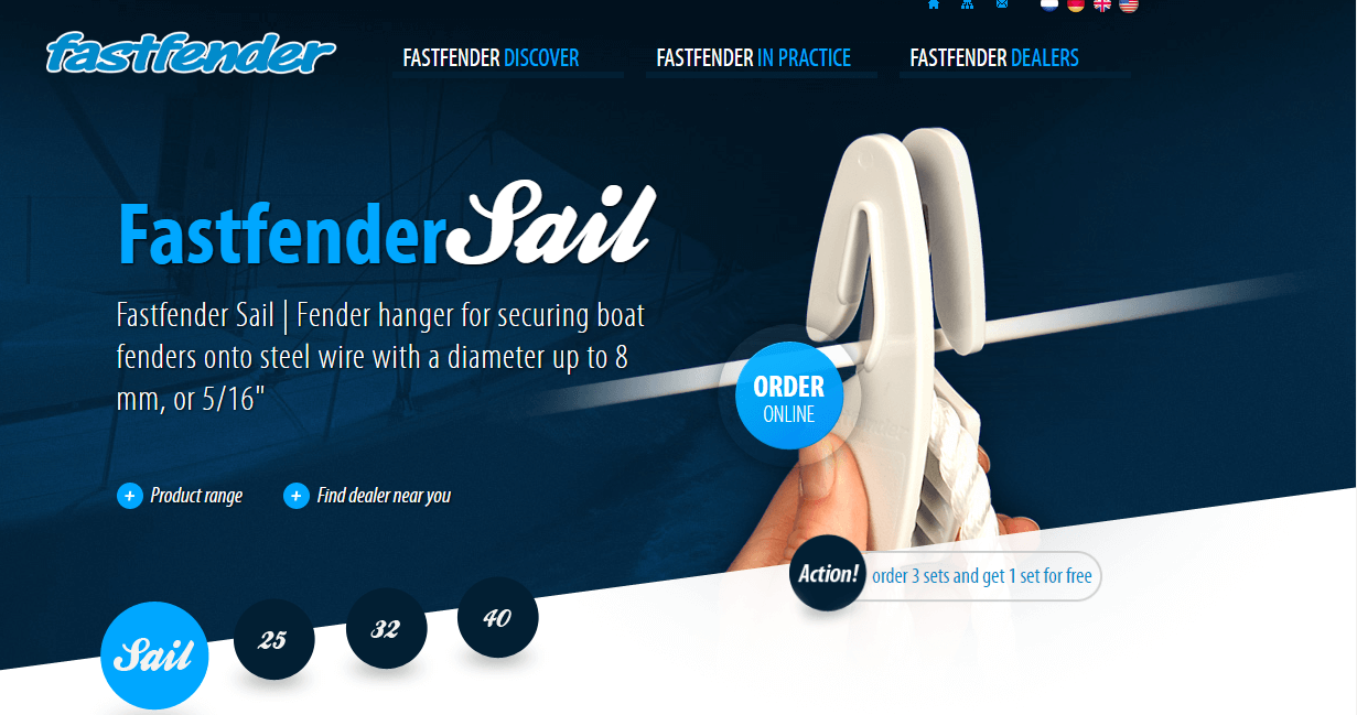
Fastfender’s slider is interesting because they use it to display their merchandise (bubbles with numbers represent different products).
One thing that could be improved is the call to action button because now there’s too much going on at the same time, and the “Order Online” button doesn’t capture the visitor’s attention immediately.
Gaillard Foundation

Gaillard Foundation’s slider is beautiful and atmospheric. It uses pictures to show off the place and text to convey their message. There’s also nothing to distract from the call-to-action button “Donate Online Now”. Well done!
Design Royale
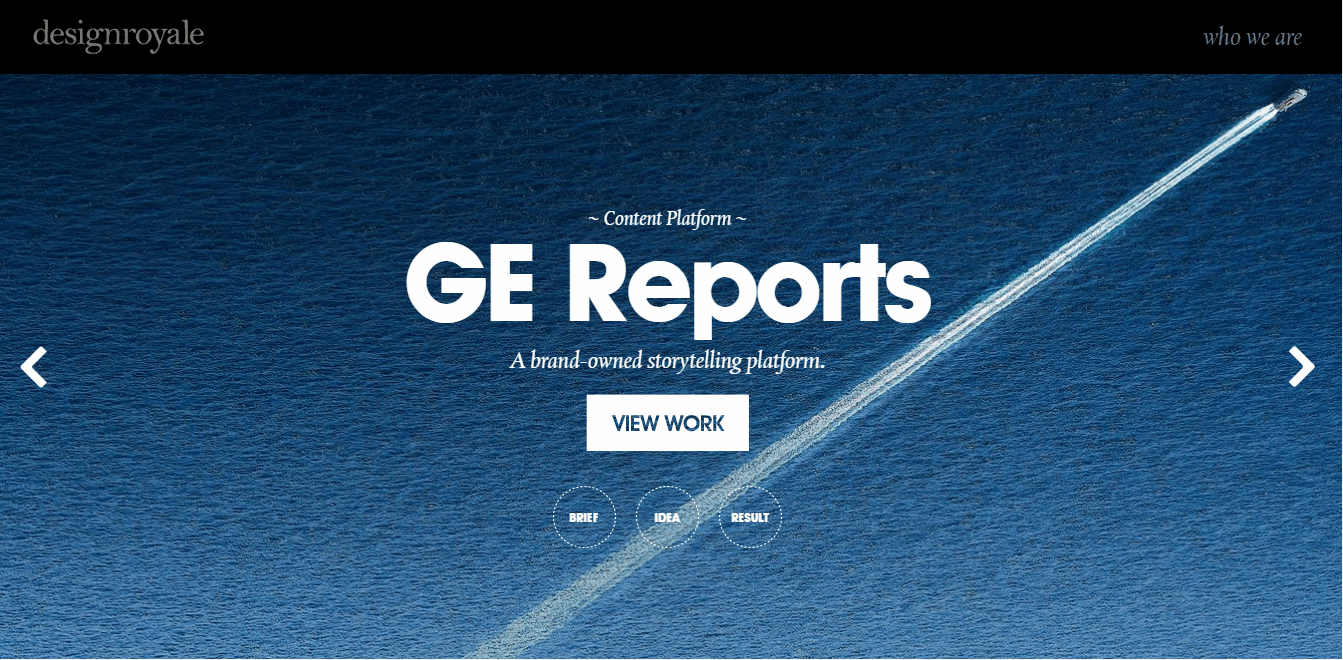
Design Royale’s slider is clean and elegant. I especially love how the call-to-action button “View Work” pops against the blue background. Also, pay attention to how navigation bubbles have titles, which makes navigation much easier.
Berkshire Salon Day Spa

Berkshire Salon Day Spa’s slider is particularly interesting because it doesn’t have any text. It’s just a collection of beautiful pictures that convey the experience you will have if you visit the spa. Bold decision!
Jason Bradbury

Jason Bradbury’s slider is unusual because it takes up the entire homepage of his website. However, as you can see, it works really well, giving his website a unique retro look and feel.
Flower Shop by Smart Slider 3
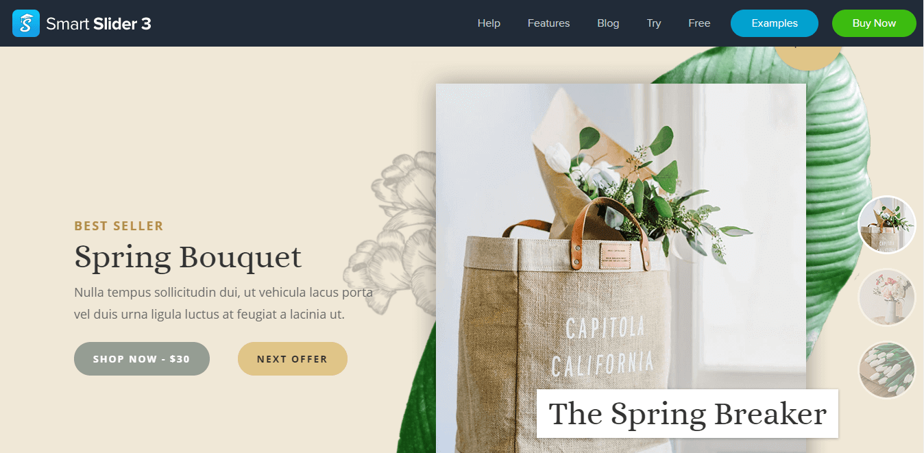
Flower Shop is one of the 100+ beautiful sliders that come with WordPress slider plugin Smart Slider 3. It has a grey “Shop Now” call-to-action button and a peach “Next Offer” call-to-action button. It also has an interesting navigation solution with navigation bubbles being set on the left side.
Conclusion
Content sliders are a point of contention among web designers. Some people love them. Some people hate them. But it’s undeniable that they add dynamism to a website.
A well-crafted content slider will make it easier for you to capture the attention of your visitors and convey your message to them. And who wouldn’t want that?
So don’t hesitate. Sure, content sliders may not be for everyone, and they may not be for you. But how will you know if you don’t give it a try?
