6 Best Practices for Designing Ad Banners for Social Media

Advertising is all about being creative and solving your customers’ pain points. Although there are some definitive rules to adopt, there is no such thing as a global standard when it comes to ad banners for social media. It will always be distinctive depending on the business. You must customize it to your company’s needs and targeted demographic.
Once you create ad banners for social media material make sure you create a thoughtful brand strategy to reach your target audience. Build and optimize your business presence via social networking platforms like Facebook, Instagram, Linked In, and YouTube.
Social media grew from a mere networking medium to keep in touch with relatives and high school pals to a massive platform that helps startups and businesses to scale their profits and extend their customer base.
Ad banners for social media is a highly focused and economical approach to reach your targeted audience. As per Sprout Social, 97% of advertisers believe Facebook is one of their most effective social media channels for advertising.
If you can figure out where your potential consumers are, you have a great chance of converting them into paying customers. It requires you to create thoughtful & well-designed ad banners for social media and appealing copy that entices your target audience to click on.
Do you want to increase your organic internet traffic with banner advertising? You might be wondering about the best practices for ad banners for social media.
In this article, we have compiled in-depth information you will need to create appealing social media ad banner designs. So, let’s get started!
1. Banner Ads Should Always Include Graphics, Visuals, or Photographs
Adding graphics to banner advertisements improves the overall effectiveness of the ad as compared to mere text that displays on the ads.
While this is important for consumer-focused businesses because it showcases their personal experience of using the specific product. For example, as soon as I look at the cone pink ice cream in the following banner ad, the first thought that comes into my mind is, “Yummmm” & I instantly feel the coolness and the deliciousness that tickles my taste buds.

Remember, you must ensure that your visuals are authentically associated with your industry and business. You can’t use visuals that disassociate your brand identity.
If you organize weddings, pictures of women in bridal dresses are fantastic, but if you offer accounting software, a person holding a laptop might not be the best pick.
You have to be a little creative as you showcase service or product on your banner ad. With a decreasing attention span, it’s important that your ad should explicitly represent your product so that your target audience can grab it without spending too much time. If the audience has to think for a few seconds, what the ad is actually about – you’ve lost.
2. Appropriate ad banners for social media
The structure is the backbone of a successful display ad. When planning together with your ad, there are several basic practices to consider.

Display advertisements should be distinctive from regular web page content. The advertisement piece should have clearly outlined borders and never be mistaken with ordinary online content.
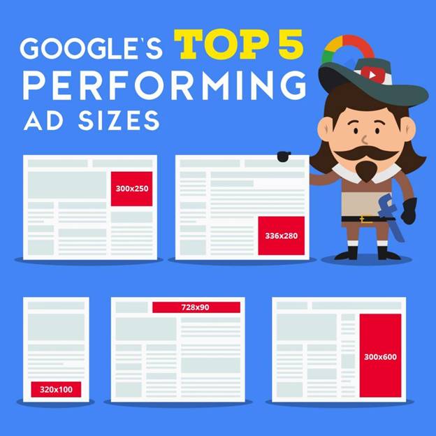
Viewers might see your advertisement on a variety of screen sizes, therefore the ad sizing must be adaptable.

From half-page advertising to leaderboards to huge mobile advertisements, there is a variety of ad sizes. The three leading banner formats are 300×250 (medium rectangle), 336×280 (large rectangle), and 728×90 (leaderboard).
You must ensure that your structure is both sturdy and flexible enough to accommodate any style, with specific emphasis paid to the best-performing sizes.
Consider the basic components of a display ad to do this. Every advertisement should include four essential elements:
- Your company name or symbol
- A proposal of value
- A picture of your facility or a graphic display of it
- A call-to-action icon
3. Be Aware Of Your Aims

Awareness and action are the two major areas in which display ads may be classified.
The goal of awareness display advertising is to show them as often as possible. Users should be able to see those repeatedly to get a better knowledge and understanding of your brand or service.
Brand awareness advertisements are perfect when your target audience has not yet identified their concern or you are trying to establish a brand position in the industry.
These advertisements might be preparing the ground of an issue or just linking your brand to a solution. That way, when the viewer has a problem, they’ll think of your company as a solution.
Measure the key metrics of your ad including impressions & click-through rates. Impressions are an important measure for determining the performance of awareness advertising.
Conversions are the goal of action advertisements. They usually provide the viewer something in exchange for visiting and filling out a form. This may be anything from a downloaded handbook to a team demonstration of a business.
4. Colour Scheme

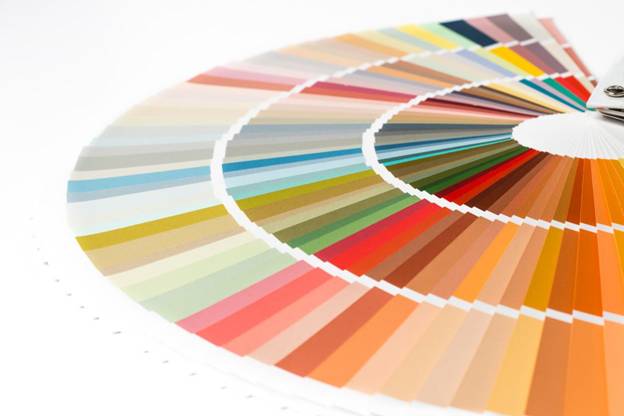
Colour is important in design thinking because it attracts people’s attention and generates emotions. Your colour palette is also associated with your brand. For example, when you hear of Coca-Cola, you automatically think of red.
Colour psychology is intriguing, and it’s something you should consider while creating advertisements. Colour choices differ based on your target audience. For example, you can not choose the same colour scheme for kids, teens, & adults. In the same way, you can not use the same colour patterns for males and females.
As an outcome, depending on who your advertisement is intended for, you may choose to utilize a rather varied colour palette.
When it comes to choosing a colour scheme for your display ad, there’s a lot to consider. As a general guideline, keep your colour palette simple. Choose two or three major colours for every advertisement.
The audience will be unable to concentrate on what is relevant if you utilize a rainbow of hues. The key portions should be highlighted with a variety of contrasting colours.
It all comes down to how well you choose your colours. Your decision must not be random, and you should consider the audience’s response to colour.
5. Typography

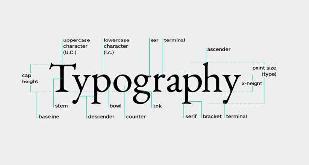
Another design element that you should consider is typography. Always establish a typographic arrangement that is readable and understandable.
It does not matter if your ad is visually stunning or not; if your viewers cannot read or comprehend your content, they would not click on it.
A bold text emphasizes the target customer’s key issue. Similarly, a bold phrase catches your audience’s attention right away. The main focus is to use the sequence and placement of your typography to guide the reader to the information you want them to see.
The typeface has undoubtedly a vital impact on the targeted audience. There are an infinite amount of typefaces available to choose from.
However, this does not imply that you should use a variety of typefaces in your display advertising. If you do this, the viewer will be unable to focus, just like with colour.
Different, complementary fonts are used to create a hierarchy. Choose a more unique typeface for anything that’s very important and could play a significant role in ads success.
Use a more conventional typeface to add information. To make specific portions of the content stand out, you could want to employ a style or a strong typeface, or both.
6. Simplicity is the Ultimate Sophistication

The size of display advertisements is quite small. While social media advertisements have wider canvasses, banner ads on websites or on smartphones might be rather constrained. Even more difficult, display advertising fights for your attention and space with a lot of other information.
That is why it is advisable to go for a simple design. Remove any unnecessary images or content and concentrate on the most critical elements.
In as little space and time as appropriate, the optimal advertisement design delivers precisely what the audience wants to know.
For instance, if it’s an awareness ad, ask yourself – what is the offer you’re promoting and why should someone download it if it’s an action ad? What is the brand name, and why should someone be aware of it?
Some marketers mistakenly convey all they believe their audience needs to know rather than developing something engaging enough to persuade the audience to study more on their own.
When going for a minimalist style, make sure your ad has the following elements:
- A viewer should be able to recognize your ad by its symbol or brand representation just by looking at it.
- It should have a clear call-to-action or value proposition that is evident: The ad’s main point must be delivered instantly and promptly.
- Display advertising is small and ephemeral, thus a strict character limit is required. The more material you use, the less likely it is that it will be read.
To Sum Up
Your brand’s success or failure is determined by the brilliance of your advertising design. In comparison to boring advertising that gets lost in the noise, creating eye-catching, captivating display ads will attract more visitors and generate more sales. That concludes the discussion!
