Why Is Mobile-First Web Design Important? 4 Actionable Tips for Creating a Mobile-First Website
In uncertain times, our mobile devices have provided us with the ability to stay connected with our families and friends, work, news, essential services, and entertainment. The necessity of a mobile-first web design is not new, but the COVID-19 pandemic has made it clearer that mobile-first websites are critical for businesses and customers. In today’s testing times, websites that are not optimised according to a mobile-first web design are proving to be irrelevant.
With mobile devices being more common worldwide than ever before, a business needs to hire a good web design company and think beyond developing just mobile-friendly websites. The primary goal should be to establish a truly mobile-first digital experience that focuses on all the essential elements of responsive web design.
What Is Mobile-First Web Design?
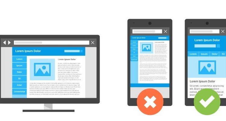
Mobile-first web design involves sketching, prototyping, and designing for mobile-first and then scaling up to larger screens, such as desktop screens. A mobile-first approach will ensure that you deliver the right User Experience (UX) to the right type of screen. During mobile-first web designing, UX designers need to prioritise the elements of a website that are most important to create a strong base that they can work their way up from.
Mobile-first web design is usually considered a replacement for responsive or adaptive design strategies. These design strategies focus mainly on the desktop (the largest screen) first and then alter the design slightly to fit a smaller screen (like a smartphone’s). Thus, the smaller screen becomes an afterthought for UX designers.
Why Is Mobile-First Web Design Important?
1. Improved User Experience
Using a mobile-first web design improves user experience since it focuses more on users’ needs and the most important content. There’s no room to add fillers, flashy widgets, or vanity features that you usually see on desktop screens in a mobile-first strategy.
Simultaneously, a mobile-first web design demands more usability research so you can provide the right content in the right amount to your audiences. It allows you to provide more content whenever your audience needs it.
2. Better Performance
A mobile-first web design offers much better web performance. This is because the fewer the elements on a web page, the faster the optimized content will load. Fast load times are also highly essential for usability and for maintaining Search Engine Optimisation.
In addition, since most internet users access Google Search engine through their mobile devices, Google’s algorithm primarily crawls and ranks pages that are mobile-friendly.
3. Increased Scalability across Different Devices
When you take a mobile-first web design, you conceptualize the user experience for mobile before any other screen. The risk of designing something that you can’t adjust later on is very low.
However, you can always adjust a mobile-first web design upwards to meet the needs of the desktop design. You can add more features as you scale up to the desktop. However, if you use a responsive or adaptive design strategy, it will be hard to go back to mobile!
4. Reduced Bounce Rate
Usually, mobile bounce rates fluctuate from 20% to 30% over desktop rates, whereas mobile conversion rates are much lower, especially for expensive items and services. This is because people using mobile devices usually search for something they can find quickly while they are on the go.
We’re sure that we all have had at least one experience visiting a website on our mobile phones. Leaving the site immediately because the web design made it impossible to use. By taking a mobile-first web design approach, you can keep your bounce rates low. Increased mobile friendliness will retain more users on your website and provide a better overall user experience.
4 Actionable Tips for Creating a Mobile-First Website
1. Keep the Design Simple
When it comes to a mobile-first web design, opt for simplicity. When users access websites from their mobile devices, they use their fingers instead of using a precise cursor. Therefore, you should not include too many flashy desktop features such as pop-ups and widgets on your website. The simpler you keep the design, the more reachable everything on your website will be, as it will even accommodate those who use their phones with only one hand.
2. Make Sure Your Mobile Site Has a Fast Load Time
We can’t stress this enough! Your audience is much more likely to be distracted and bounce away when using a mobile device rather than a desktop. This means that your website’s performance should be up to the mark. It should load quickly and have a fast connection speed. All links on your website should also work well and direct your audience to what they are looking for. A quicker load time and a pleasant and easy user experience will reduce your bounce rate.
3. Ensure the Visuals Are Captivating
As we mentioned earlier, people who access a website from a mobile device are more likely to leave the website if it has many distractions. Therefore, you must use images and other visuals that are bright, memorable, and grab attention. Remember to avoid using visuals that are too big, as this can slow your website’s connection speed.
4. Prioritise Navigation
Lastly, prioritise navigation on your site. It plays a crucial role in a web site’s success as it allows visitors to flow from one page to another quite easily. If you do not prioritise navigation, you can lose a large number of visitors, and this can hamper your website’s success.
Whether you are designing a website for mobile or desktop users. Ensure you offer easy and convenient navigation options to your users. When using a mobile-first web design approach, shrink your navigation bar down to the fewest possible options. It contain all secondary elements into navigational buttons that your users can easily reach.
Final Words
The mobile-first web design principle has a vital role in web design. As smartphones become more and more powerful, neglecting a mobile-first web design can be considered a digital sin. Providing an easy user experience should be your top priority. A web design company can help you ensure your audience has a pleasant experience when they visit your website.