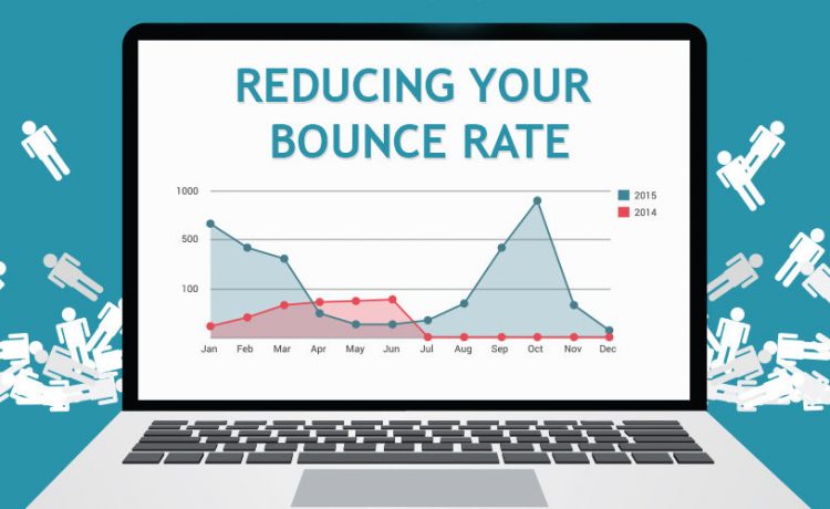
8 Ways to Stop Visitors from Leaving Your Site

You’ve put a lot of effort into creating your website. So, why isn’t anybody interested in reading your content? There are different reasons why someone may quit that are beyond your control – they clicked the incorrect link, they mistook you for someone else, their browser crashed – but although your bounce rate will never be zero, reduce bounce rate should be a top goal.
Your first objective as a marketer should be to turn those one-time visitors into buyers. You won’t accomplish this objective if visitors don’t stay around to read your material.
Determine your target market. The longer your visitors continue on your site, the more engaged they will be, and the more likely they will convert.
Let’s have a look at a few ways to keep visitors on your website longer:
User Experience
The User Experience, or UX, of a website, is the experience users have when visiting the site. From the moment they arrive until they leave, it includes the physical experience they have while scrolling through the site and navigating through it while reading the content, and even includes the feelings they get from visiting your site. If your site has bad UX, that means that your visitors are not having a good experience on your site, which increases the likelihood of them leaving. Therefore, improving your UX will likely reduce bounce rate. You need to make sure everything is well-designed, intuitive and easy to navigate while giving the user everything they need from your site.
Content’s Readability
High-quality material is entertaining and educational. The content should be simple to read and explain how your goods or services benefit consumers and how they may buy them. Be direct and concise. Content should be created for your target audience and reflect your brand’s voice. And lastly, no typos or grammatical mistakes. If you need assistance with anything, let me know.
Remember that great content isn’t simply great words. Include relevant pictures and videos to entice visitors to your site. Adding value will entice people to stay longer. The longer they remain, the more pages they’ll see.
Set up Links
Make it simple to browse your site if you want visitors to visit numerous pages. Internal links, or rather, connections to other pages on your site, may help. Internal linking may help to reduce bounce rate. For example, if you encourage people to contact you with questions, link to your contact page. If you mention an item or any product in your blog, link to its page.
HD Images
On the internet, images are the most engaging type of material. We like to gaze at pictures rather than read words like humans. This is why the majority of prominent websites’ landing pages utilize Fullscreen background pictures.
There are plenty of platforms to go for higher-quality pictures such as Shutterstock or Pexels. Thousands of pictures, vectors, and drawings are available for you to use on your website. Many websites also provide high-quality royalty-free pictures.
Mobile Friendly
This is something you should have done a long time ago, but many websites haven’t bothered. It’s been two years since Google declared that websites that aren’t mobile-friendly will be de-prioritized in their search results. They do, however, make it through — particularly when they are the greatest response to a search query. Unfortunately, using a phone to browse a non-mobile-optimized website is a really unpleasant experience. Not only can mobile optimization help you get more views overall, but it will also help you retain more of the visitors you get.
Make it Credible
Why should users trust your website? Adding real-life pictures to your website makes it seem more trustworthy. Include biographies and testimonials.
It may also help you gain reputation and influence. See how to use social proof to build your company. Add secure site indicators, ratings, honours, and certificates to your website. It encourages people to exchange information and transact on your website.
Compelling CTA
Finally, the greatest approach to encourage visitors to keep exploring is to use appealing calls-to-action — large, clickable buttons that promise more of what they’re looking for. Even if you’ve already piqued their interest, make it clear what they should do next; they’ll be far more inclined to follow through. You place it in a large red circle with the words “CLICK HERE TO LEARN MORE” on it.
Your visitors came to your website for a purpose. Rather than depending on them to do the legwork, you should create a clear conversion path that takes them exactly where you want them to go: to a point where they’re giving you their email address in return for something useful.
Conclusion
Keep in mind that your website viewers are unable to read your thoughts. Don’t be afraid to tell them what you want them to accomplish on your site to assist you to lower your bounce rate.
These methods should help your site function better, but you may still need to dig further into your analytics data to figure out exactly where losses are happening and how they may be avoided. With research and testing, you should be able to keep your visitors on your site for longer.
