10 UX Tips To Consider When Creating Your Website
Hey guys in this article we will discuss the 10 best UX tips that you can consider when Creating Your Website. So let’s begin: Great user experience (UX) goes a long way. The experience your website creates for your visitors sets the foundation for a strong connection with your product or service.On the other hand, a confusing and outdated website design can cause visitors to bail quickly, never to return again.
Attention spans are getting shorter. And you need all the advantages you can get to attract visitors and keep them on your website. That’s where proven UX tips can help make a difference. So now let’s have a look at our best UX tips to consider when creating your website.
UX Design Best Practices
Here are our best recommendations to create a delightful user experience that engages your target audience and removes any friction in the process of enquiring about your services or purchasing your products. You can search for also top UI UX Design Agencies & user experience consultants for better design.
Know Your Users
Before you apply any of the other UX tips mentioned in this post, you need to have a clear understanding of who your target audience is. Ask yourself questions like: What do they like? What are their needs? What can your website offer them that they can’t find anywhere else? Then use this information to build user personas.
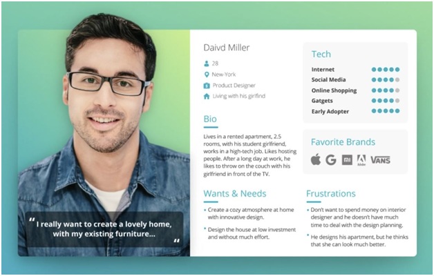
Your website design should be based on real, concrete information, not guesswork. To learn more about your target audience, you can use market research techniques such as polls, surveys, and good old customer interviews.
Focus On Quality Of Content
Great UX design is not just about appealing layouts. High-quality copywriting is just as important. Ensure quality material that’s easy to understand, to the point, and not wordy. The perceptions of users can be influenced to a great extent by well-written content. Again, this is where market research can help by identifying your users’ informational needs.
Keep It Simple
When a visitor lands on a page, you have less than 15 seconds to capture their attention. If you want to keep their focus, your website layout should be clear and free from clutter. In other words, users will easily understand what your website is about if there is less content to browse through and few options to pick from. For example, consider Virgin’s website.

The decluttered experience can help ensure that your visitors take the actions you want them to take the most, like joining your newsletter or adding a product to the cart. Moreover, your site will be lightweight and load fast, boosting both SEO and conversions.
Make Different Elements Distinct
When designing a website, you want to ensure a flexible user journey and engaging experience. This can be achieved with a visually distinct layout. The point is to make it easy for your visitors to find what they are seeking with the least effort. For that to happen, the most important information needs to stand out the most. You can also use tools like Colorsafe and Usecontrast to check whether the colors and contrast you are using are adequate.
Ensure Responsive Design
Mobile usage has long surpassed desktop, and it’s rising fast. That’s why it’s important to have a website that renders well on any device, like Alta FoodCraft.
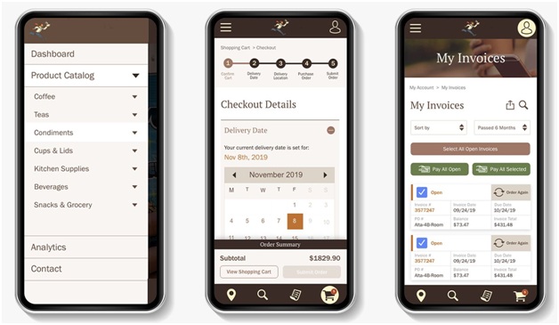
A UX design that doesn’t adapt to device size forces users to give up trying to navigate your site, whereas a responsive website can not only help enhance user experience, but also SEO. Use tools like Google’s Mobile-Friendly Test and BrowserStack to check for website responsiveness.
Maintain Brand Consistency
Your branding is the image of your business in the eyes of your target audience. Your website visitors will assess your value not just based on your products or services, but also how well you showcase your brand. So when planning your website, keep your brand identity consistent. Make sure to use the same logo, color palette, typography, type of graphics throughout the user journey to forge an identity into their minds. Keeping consistency will help people easily recognize your brand regardless of where they find you.
Follow A Visual Hierarchy
Visual Hierarchy refers to making design and placement decisions in a way to influence which elements on a page get noticed by users first, then second, and so on. Case in point: Shearline.

When designing a user experience, for instance, you’ll want to give some elements more priority than others. These include your main value proposition and CTA. So achieving this goal will involve decisions like placing these elements above the fold, or making them bigger and bolder than other elements.
Choose Your Colors Wisely
Colors are an important part of your design, with each color invoking a particular set of emotions to associate with our brand. For example, the color red exudes passion and energy, while blue invokes calmness and reliability, as illustrated by NHS.
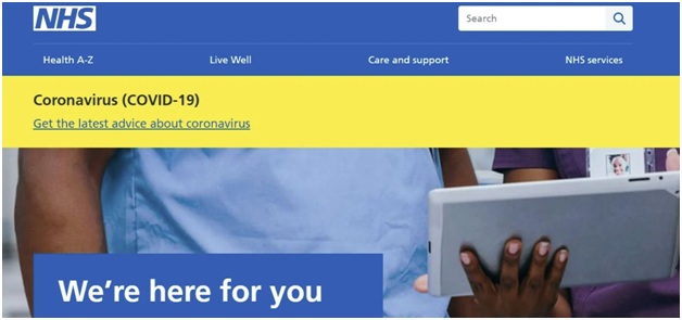
When it comes to color selection, it’s important to stick with a consistent theme. Once you decide on a color palette, you need to follow through and keep your primary and secondary colors consistent throughout the entire user experience.
Use The Right Typography
Typography refers to the properties associated with the text, which impact how your brand comes across. It includes font type, size, style, spacing, and color. For instance, Pest-Stop Boys’ large typography helps them make a statement and stand out from competitors.

You want to pick the fonts which complement your brand. Also try to ensure that the fonts you pick are “web-safe,” in the sense that they are available on most devices.
Optimize Website Navigation
Navigation is the backbone of your website. It should be intuitive, easy to use, and not make the users think. Verk is a great example of a website with clean navigation that keeps things to the point.
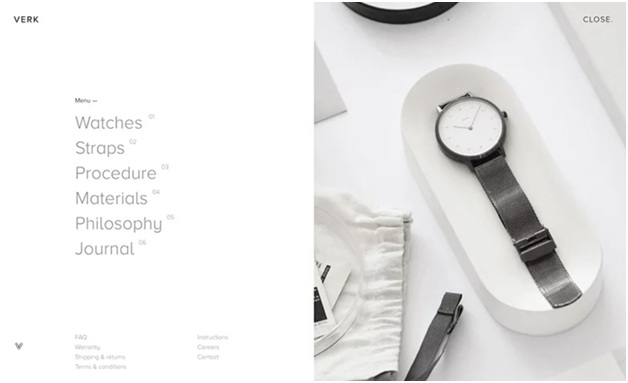
For your website navigation to be effective, it has to find a balance among the number of options. Use just enough to give adequate information but not overwhelm the user.
Wrapping Up
It’s one thing to read about the best UX tips, but another thing to implement these best practices for your website. So take your time and do it in sprints. You can’t do this all in one go. The more you pay attention to the little nuances of color theory, responsiveness, typography, and more, the better the final result will be. I hope you liked my efforts in explaining to you about 10 UX Tips To Consider When Creating Your Website.
