8 Easy Ways To Boost Your Checkout Conversion Rate
Hey guys, if you are looking for easy ways to boost your checkout conversion rate then this article will be very valuable for you. So keep reading.
Your eCommerce business can get frustrating when it doesn’t yield enough profit. It’s even more frustrating if you know your business offers quality products but somehow cannot convince customers to push through with their purchases.
Checkout abandonment is a form of cart abandonment. It is when users decide not to push through with the transaction just when they’re about to check out of the online store. This article will discuss eight ways to improve your checkout conversion rates and generate more profit.
Let’s jump in!
List of The 8 Easy Ways To Boost Your Checkout Conversion Rate:
1. Single Page Checkout Process
2. Don’t Force The User To Sign Up For Your Website
3. Optimize The Checkout Experience
4. Offer Added Benefits
5. Avoid Too Many Fields During Checkout
6. Use Retargeting Campaigns
7. A/B Testing
8. Include Shopping Cart Recovering Emails
9. In Closing
1. Single Page Checkout Process
Imagine this scenario:
You visit a retail store to get a few things. However, you can’t leave right away because the cashier keeps looking at your items, scans their barcodes, looks up their prices on a database, scans them again, then knits their eyebrows while asking for your contact information. Knowing there’s a nearby store where you can get what you need faster, what would be your next move?
That’s right: you leave. This applies to your online store too. A complicated checkout process with multiple steps will turn off customers who have other things to do. They’ll abandon their carts. Simplifying your checkout process will help your customers complete their transactions faster and give them fewer opportunities to end their purchases prematurely.
One way of accomplishing this is by creating a single page where customers can input their contact information and order details and complete their transactions. A single-page checkout process “flattens” the shopping experience and convinces customers that all they need to do is input their details and click on “Buy Now” — you’ll take care of the rest.
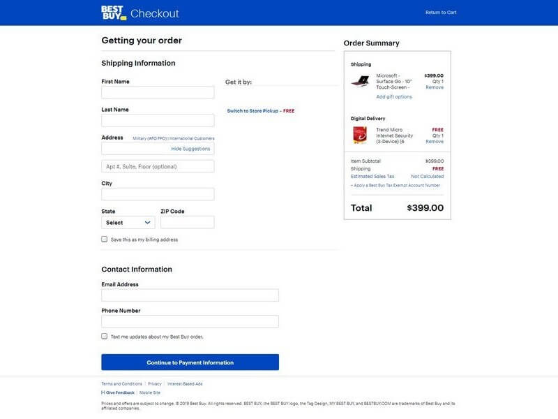
For instance, Best Buy’s single-page checkout process is so simple that even an untrained person can make a purchase. It only takes a few keystrokes, and two or three mouse clicks to push through with the transaction. In addition, Best Buy keeps images to a minimum, reducing page load time, you can do this by investing in good site hosting like a great BlueHost alternative, and reassuring customers that their purchases will go through.
2. Don’t Force The User To Sign Up For Your Website
Signups might be counter-productive for e-commerce conversion if you make them mandatory. Mandatory signups are one of the most common reasons why shoppers abandon their carts.
To work around this type of behavior, you can offer consumers the option to purchase as a guest instead. This method allows you to capture first-time buyers while still allowing them to create an account and enjoy exclusive members-only offers.
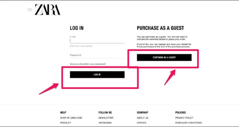
Zara lets its customers choose between purchasing as a guest or creating an account. As guests, customers can place orders and add their delivery details without feeling obliged to sign up.
Remember, your goal is to convert the user into a paying customer. You can always get them to sign up after they’ve purchased by offering discounts or promo codes.
3. Optimize The Checkout Experience
The checkout process is an essential part of the shopping experience. Even if you drive traffic to your site, if the traffic doesn’t convert, well, you will have accomplished nothing. Get the checkout process wrong, and you might lose potential customers and customers.
The easiest way to optimize your checkout experience is to use a tried and tested, customizable template that makes the life of your website visitors easy.
You can use Paykickstart’s API to create seamless, custom experiences for your users. This API supports payment processor tokens that allow eCommerce websites to store credit card information securely, reducing the need for users to input their card details on websites that they frequently visit. It also helps businesses create convenient one-click upsells for additional revenue.
You must pay attention to potential first-time buyers, too. Take away anything that might distract them at this point, such as ads or pop-ups. Instead, focus on putting fields that collect important information like email addresses, that you should always confirm using an email verification tool.
You also need a system that allows them to correct their mistakes without going back to previous pages. Myntra executes this perfectly with its simple checkout system.
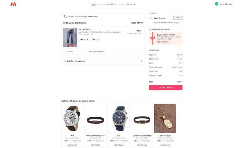
They allow visitors to remove or add orders from their wishlist without leaving the checkout page. This optimizes the checkout page and prevents their customers from having second thoughts.
4. Offer Added Benefits
Added benefits are an excellent way to boost your checkout conversion rate. Think of it this way. Consumers want deals, and everyone loves freebies.
Seasonal discounts and cashback would go a long way to increasing conversion checkout rates. Nevertheless, never go ham on them. Create an equilibrium by offering new shoppers discounts on select products to entice them. You may also consider throwing in items that complement their purchases to give them more value for money. Finally, you can go to Amazon and offer free shipping.

There are two ways you can enjoy free Amazon shipping. First, you can get your shipping fees waived by signing up for Amazon Prime, regardless of your purchase’s total cost. Second, you can qualify for free shipping by ordering more than $25 worth of items.
You may also offer more perks using pop-ups. You can set up pop-ups to appear when your website detects that the user is about to switch to another tab or leave the site altogether:
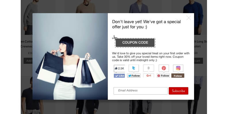
For the most part, more than five out of ten shoppers will complete their purchase if the products in their shopping carts are offered at a discount. By leveraging this, you pique their interest and secure conversions.
5. Avoid Too Many Fields During Checkout
Most shoppers are not interested in revealing too much about themselves. They will draw the line by giving you their personal information. They might consider it an invasion of their privacy.
To avoid this, you must list all the fields you need to complete an order. On the one hand, you will need a user’s credit card expiration date to verify that their card number is valid. On the other hand, you won’t need their birthday for the same purpose.
Understandably, you will want to get your customers’ demographic to create targeted campaigns. However, the point of purchase is not the right time to ask for that information. You’ll get that chance sooner or later.
6. Use Retargeting Campaigns
Retargeting campaigns simply target people already familiar with your site or have recently viewed your products. The concept behind this is that you’d have greater chances of converting people who are already interested in your products. As far as showing interest is concerned, nobody is more interested in your products than someone who was close to clicking on “Pay Now”.
Retargeting campaigns remind visitors of your products and services after they leave your website without buying. It’s a vital tool to build a relationship with your customers and boost your checkout conversion rate.
You can use Google Ads to show your product pages whenever a would-be customer searches for similar products. You may even avail of guest post services to ensure that your content appears on long-tail keyword searches related to your niche. Guest posts can help drive traffic to your website. It also has the side effect of increasing awareness of your products.
Facebook retargeting is also one of the most common retargeting methods among online marketers. You can easily set up Facebook to show ads to people who exhibit specific types of behavior, such as visiting and leaving your page or abandoning their shopping cart at checkout.
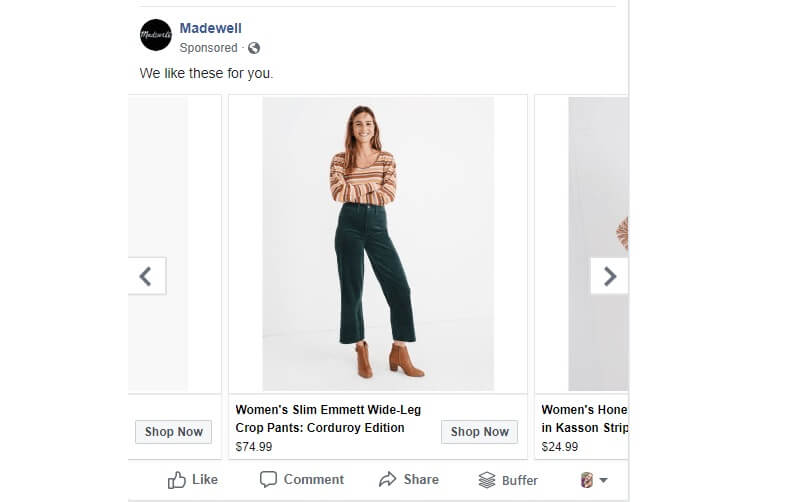
Madewell, for example, is a clothing brand that customizes campaigns on social media. They do this based on their user’s activity on their site. As you can see, this retargeting campaign is clear and straight to the point, making it easier for their customers to reach a decision and shop from them. The written copy — “We like these for you” — also seeks to convince users that the product they just abandoned is something they should buy.
7. A/B Testing
A/B testing is an optimization technique that sees the testing of two versions of the same content with slight differences. With the technique, you focus on one element at a time to distinguish results accurately and analyze your visitors’ behavior from an informed perspective.
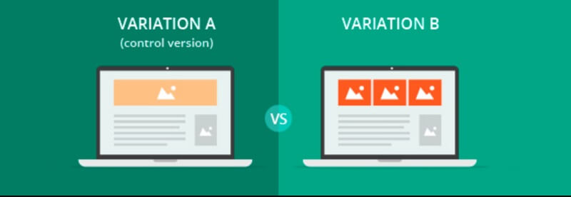
That way, you determine the right approach for your customer’s preference and gauge the effectiveness of certain features on your page.
But it doesn’t stop there. You’re also able to view the behaviors and interactions on the page from your audience’s perspective.
For instance, you can analyze visitors’ interaction with your site on desktops, laptops, and mobile devices. Notice the features that make your store stand out in both variations and optimize further on that. You can change images, CTA button placement, and even your website copy based on your results.
8. Include Shopping Cart Recovering Emails
By sending cart recovering emails to your customers, you give them a gentle nudge to proceed to checkout. According to Salesforce, sending recovering emails recovers 60 percent of lost sales.
Don’t know how to go about this? It’s simple. Create an automated email sequence that reminds visitors to proceed to checkout. You may send these emails anytime from a few hours to three days.
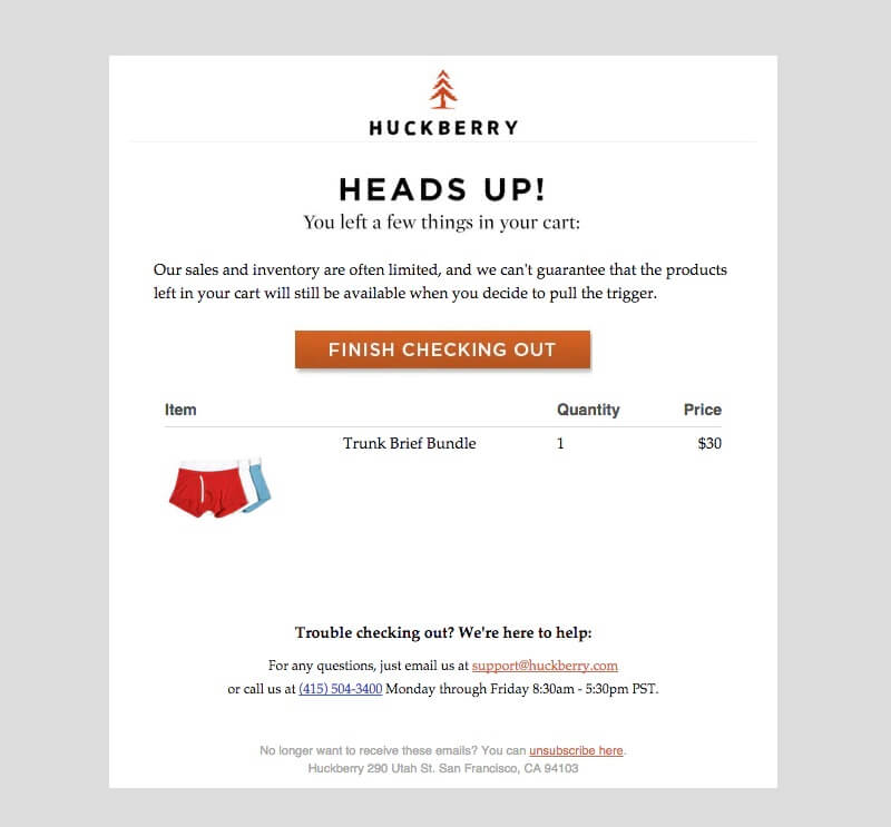
Huckberry sends cart abandonment emails to visitors that leave their carts behind on their website. They also use catchy email subject lines and engaging copy to pique the interest of their customers to increase open rates.
Dollar Shave Club plays the game well, too, with their witty cart abandonment emails.
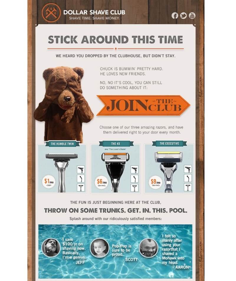
They do not only tell their customers to complete their purchase (or, in their words, to “join the club”), but they do so subtly with social proof in the form of funny testimonials from “ridiculously satisfied members”.
You can use customer testimonials to persuade first-time buyers that your products are worth buying. However, If they’ve bought from you before, offering incentives such as discounts might be an excellent way to generate repeat sales and increase checkout conversions.
In Closing
Your checkout conversion rate would not automatically increase in a day. However, following the above easy ways to boost your checkout conversion rate would give you a chance to redeem your online business.
For starters, avoid too many fields during checkout. While you’re at it, test your site to see how it works from your customer’s perspective. This would give a better insight into what you could improve in the future.
While many consumers can’t resist a great deal, many first-time buyers will be wary of deals that are too good to be true. Regarding this, you must never go over the top with the deals or incentives you offer visitors. These tips aim for an overall simple site to improve user experience and ultimately increase checkout conversion rates.
Bio
Nico Prins is the founder of Launch Space. He helps SaaS companies scale their lead generation through effective content marketing.
